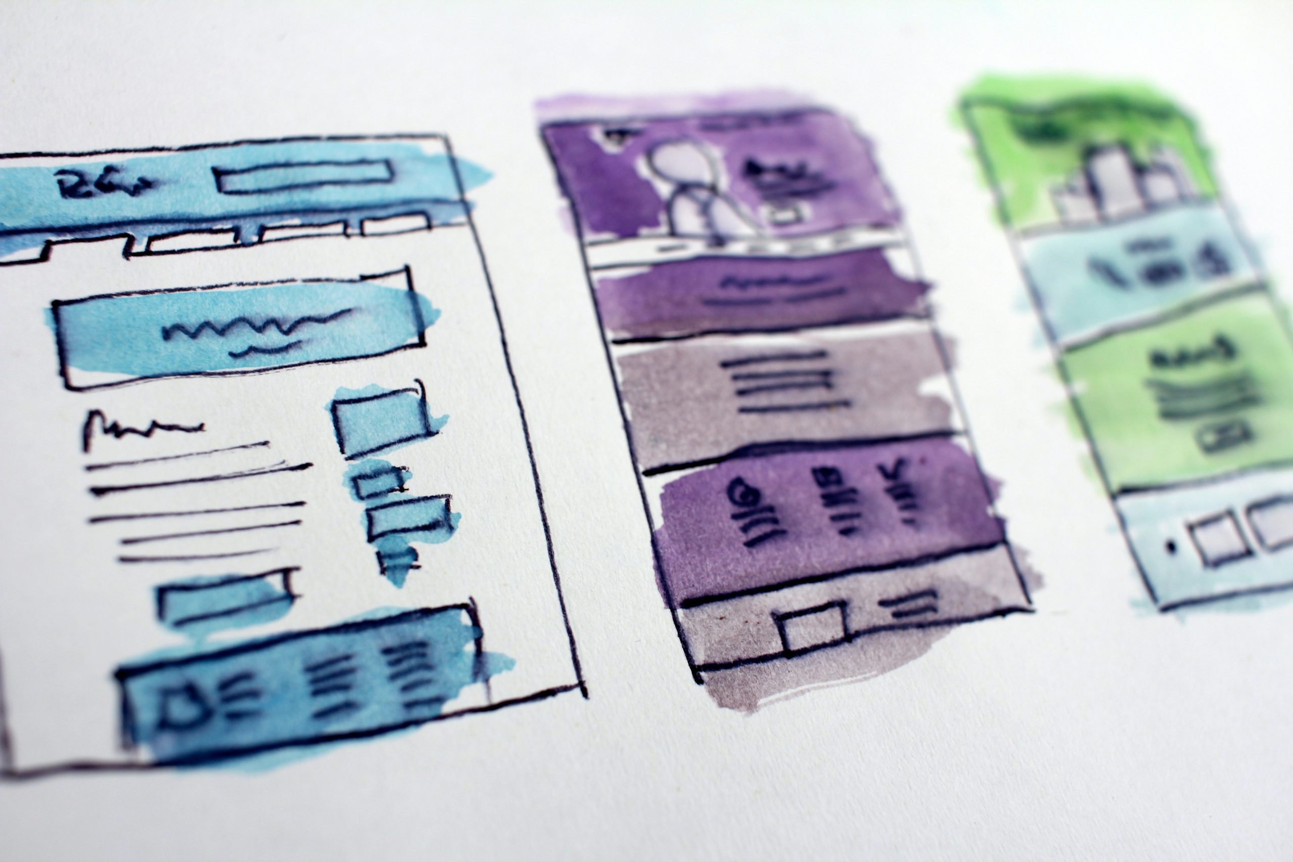
The road to launching a completely new brand began about 6 months ago. It was hectic and tedious, but important. We started by evaluating our previous (then current) brand and outlining a set of personalities and characteristics of our nonprofit organization. Then we moved on to focus group discussions, surveys, sketches, and even hired outside consultants. We ended up with a brand that exposes our personality and speaks of our work. Akash, our CTO, and Thimal, our COO, spent days and nights leading this effort.
Before I go any further, I want to recognize one socially motivated tech-company – Breakout Designs in Australia, who have always supported us in our tech needs. Breakout Designs became our consultants through this entire process and did an amazing job to elevate our brand and website infrastructure.
A new brand meant launching a completely new website. We had specific goals for this website such as introducing our mobile app, realigning user focus, embedding brand elements, and establishing a web infrastructure that is flexible and strong at the same time. Among these conversations, we acknowledged a new goal – accessibility.
Our vision is to create 7 billion volunteers in the world. At some point during our journey, many of these volunteers would have to visit our website. So for us, making the website accessible was not just about “being nice.” It was a strategic goal we wanted to achieve. Our old website was not accessible and I don’t want to lie and say that our new website is perfectly accessible either, but this website that you’re on right now is much more accessible than an average website you’d find on the internet.
University of California, Berkeley outlines 10 tips on how to make your website accessible. Here is how IVolunteer International has taken the commitment to make our new website more accessible.
1. We run on a content management system that supports accessibility.
Our website is built on WordPress, a content management system that supports accessibility. I want to thank Breakout Designs in Australia for providing us unlimited web-support and CloudCone for hosting us for free. WordPress includes elements like editing toolbars and video players that support creating accessible content. For example, editing toolbars include options for headings and accessible tables, and video players include closed captioning. The CMS administration options (such as creating a blog post or posting a comment) are accessible as well.
2. Organizing the hierarchy and structure of our content.
The website is built by taking into consideration content hierarchy. Screen reader users can use the heading structure to navigate content. By using headings (<h1>, <h2>, etc.) correctly and strategically, the content of our website is well-organized and can be easily interpreted by screen readers. We have also encouraged our writers to organize blog content according to these specifications. In all honesty, when it comes to organizing hierarchy and structure of “content”, our website is nowhere close to perfect. But we have made a commitment for steady improvement.
3. Including alt-text for images and descriptive texts.
Alt text is provided for images, so that screen reader users can understand the message conveyed by the use of images on the page. While we have a lot to improve on alt-texts, especially on our blog content, we have made the commitment to add alt-texts to all of our images moving forward. In general, alt-texts are especially important for informative images (such as info-graphics).
We have also included descriptive labeling and clear indication of keyboard focus on links, buttons, forms, and any other element that a user can interact with. When including links in our content, we use text that properly describes where the link will go. Just like sighted users scan the page for linked text, visually-impaired users can use their screen readers to scan for links. As a result, screen reader users often do not read the link within the context of the rest of the page. Using descriptive text properly explains the context of links to the screen reader user.
4. The entire website can be navigated with just a keyboard.
Assistive technologies rely on navigating the website with just the keyboard. Even if a certain special device has several different buttons, and not a keyboard, those buttons will be mapped to keys on the keyboard. In essence, our entire website can be used without a mouse. Users with mobility disabilities, including repetitive stress injuries, may not be able to use a mouse or track pad. These people are able to access content through the use of a keyboard by pressing the “tab” or “arrow” keys, or through the use of alternative input devices such as single-switch input or mouth stick. As a result, the tab order is matched with the visual order, so keyboard-only users are able to logically navigate through site content.
5. Fonts, colors, and size.
When we talk about accessibility, focus shouldn’t only be about people who use different navigational software and hardware. We realize that color combinations, font styles, and sizes can affect accessibility for people who use traditional technology to browse the internet. Our brand logo, Exo 2 is a Google font that is freely available for download and has characteristics that make it clear and prominent. Our font sizes are carefully implemented – large enough for anyone to see but small enough to blend in with our overall website design.
Navigating the component of “color” on the topic of accessibility has been relatively challenging for us. Red, is one of our main brand colors. We know that most common form of color deficiency, red-green color deficiency, affects approximately 8% of the population. That’s why, although we can’t remove “red” from our brand colors, we have taken the effort to embed lighter colors such as mint, white, black, and pink into our website.
While our website is definitely not perfectly accessible, we are proud of the accomplishments on accessibility we have achieved on our website so far. Today, we make a commitment to make our website accessible to everyone, in our efforts to eradicating challenges people face when they volunteer.
IVolunteer International is a 501(c)3 tech-nonprofit registered in the United States with operations worldwide. Using a location-based mobile application, we mobilize volunteers to take action in their local communities. Our vision is creating 7-billion volunteers. We are an internationally recognized nonprofit organization and is also a Civil Society Associated with the United Nations Department of Global Communications. Visit our profiles on Guidestar, Greatnonprofits, and FastForward.
This article was in-part written and sponsored by Breakout Designs Australia. Breakout Designs Australia is IVolunteer International’s strategic partner.


